WANDERLUST
AESTHETICS - JAPAN
There are at least as many different styles and trends in Japan as anywhere else I’ve been, of course. But more than anything I noticed two aesthetic tendencies that almost seemed to contradict each other. Tradition vs. manga. On the one hand an extremely simple, subtle, minimalistic style (which I really enjoyed) and on the other a very loud style both when it comes to the use of colour and form (which I am slightly more half-hearted about).
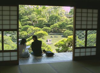
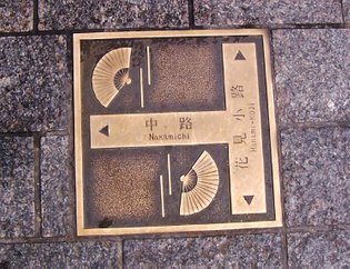
The pictures above are, left to right, from the Manshu In Temple at Kyoto, where I am standing completely lost in my own thoughts, Kinkaku Ji also at Kyoto, and finally a part of the rock garden at Hokoji Hansobo.
I really liked the simplicity and serenity of the traditional building style. A wooden structure, shoji doors, tatami mats and big, empty spaces. Simplicity in the most positive meaning of that word. It gave me such inner peace to enjoy the tranquillity of a temple or the park surrounding it. And this was of course one of my reasons to visit Japan: To enjoy some peace and quiet. To relax. Even though I travelled a lot around, I also managed to enjoy these peaceful moments. It was almost possible to physically feel you beta brain waves turning into alpha waves and your blood pressure reducing.
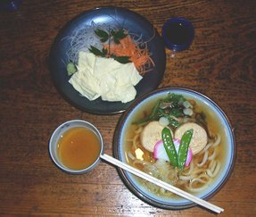
I felt that so many things in Japan were made with a great sense of detail, precision and a specific sense of aesthetics, exemplified in two of the pictures above. A plate in the pavement (sidewalk) with the names of two streets in Kyoto, and my lunch at Nikko. We only made a fast ‘pit stop’ for lunch, but even this ‘fast food’ was so beautifully arranged, as always.
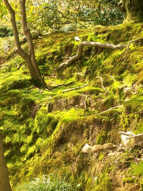
One of the first words I learned in Japanese was koke (moss). It was everywhere. We tend to look upon it as a weed at home and do what we can to get rid of it. I returned home with a completely different view. It was so beautiful, especially at the rock gardens, when the sun would shine on it.
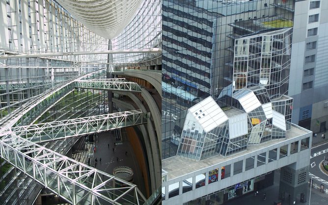
Many of the modern buildings could probably have been almost anywhere in the world, but I did see a tendency to use various small geometrical shapes repeated almost infinitely. The first picture below shows the Tokyo Forum, which was almost zeppelin shaped with thousands of squares and triangles in the design and structure. The second picture is from the square just outside the main station at Kyoto.
With the risk of simplifying too much, I’d say that modern Danish architecture is also based upon clean and strict geometrical shapes, but often much larger shapes without the many small details. World famous buildings created by Danish architects include the Sydney Opera House (designed by Jørn Utzon) and the new Triumphal Arch in Paris (Von Spreckelsen). And today of course the big Danish architect is Bjarke Ingels, with anything from the Lego House in Denmark to Hualien Residences in Taiwan and Via 57 in Manhattan on his CV.
Like the Tokyo Forum, the IT University at Copenhagen, which I attended a few years back, also has an open atrium which spans 5 or 6 floors and lets in lots of light. But the architectural statement is completely different. And believe me, it would definitely be an advantage not to have any fear of heights, when you sat in one of the rooms projecting over the grand atrium hall. It felt like sitting in a box floating above an abyss!
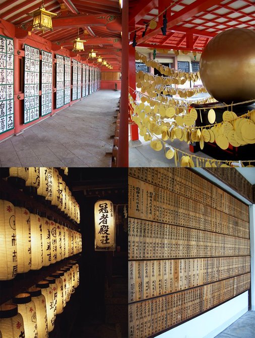
I also noticed the use of repetition many other places, especially in some of the temples. One object may seem trivial and insignificant. It is a completely different expression when you have hundreds, sometimes thousands, of the same or similar objects together.
In the collage below, clockwise we have pictures from Sengen Jinja, Ryozen Kwan-Non in Kyoto, lamps in the Gion district in Kyoto and another picture from Ryozen Kwan-Non.
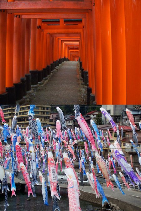
One of the things that left the most lasting memory with me was walking through the literally thousands of red torii by the Fushimi Inari Taisha Shrine in Kyoto. When you looked at one gate at a time, it was nothing special, but together they were extremely beautiful. This is also illustrated below, along with the koi carp, which is a symbol used for celebrating the boys’ festival. Many people had put up one or two by their houses. But by a river in central Kyushu we stopped to take a look at the hundreds and hundreds of koi carps. Again, a special moment because there were so many of them in one place.
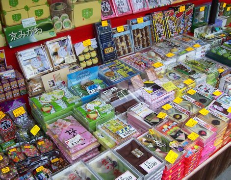
I really, really liked Japanese food (please see my separate page about this) but I did not like Japanese sweets so much. I enjoyed the display of sweets, though. Everything was presented so beautifully and with such a feeling for detail. Even the way they wrapped the box for you was an art.
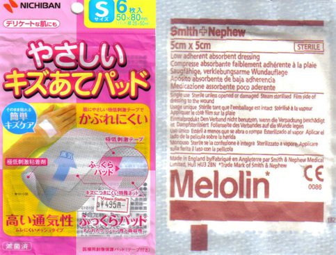
The second Japanese trend I referred to earlier: Very colourful. Very detailed. Very eye catching. Many signs, shop windows, clothes, etc. were dominated by strong colours and cartoon illustrations. One day, I went into a pharmacy as I needed to buy a small bandage and it took me a while to find what I was looking for even though, once you spotted it, it was extremely obvious what it was, as there was a clear illustration on it. My mind, however, was probably still set in Denmark mode, and here such packages look extremely ‘clinical’. I don’t know what to associate with the colours and style of the Japanese pack. Maybe chewing gum?! But the Danish pack certainly looks dull!
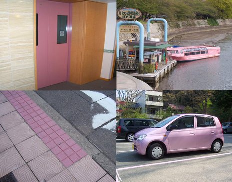
Finally, it seemed as if almost everything was available within the pink/fallen angel colour scheme: elevator doors, river boats, markings on the pavement, cars, you name it!
© emenel 2020

